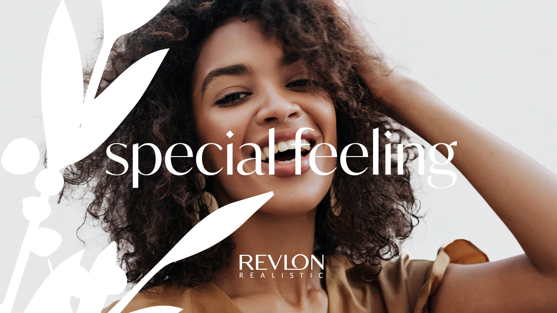
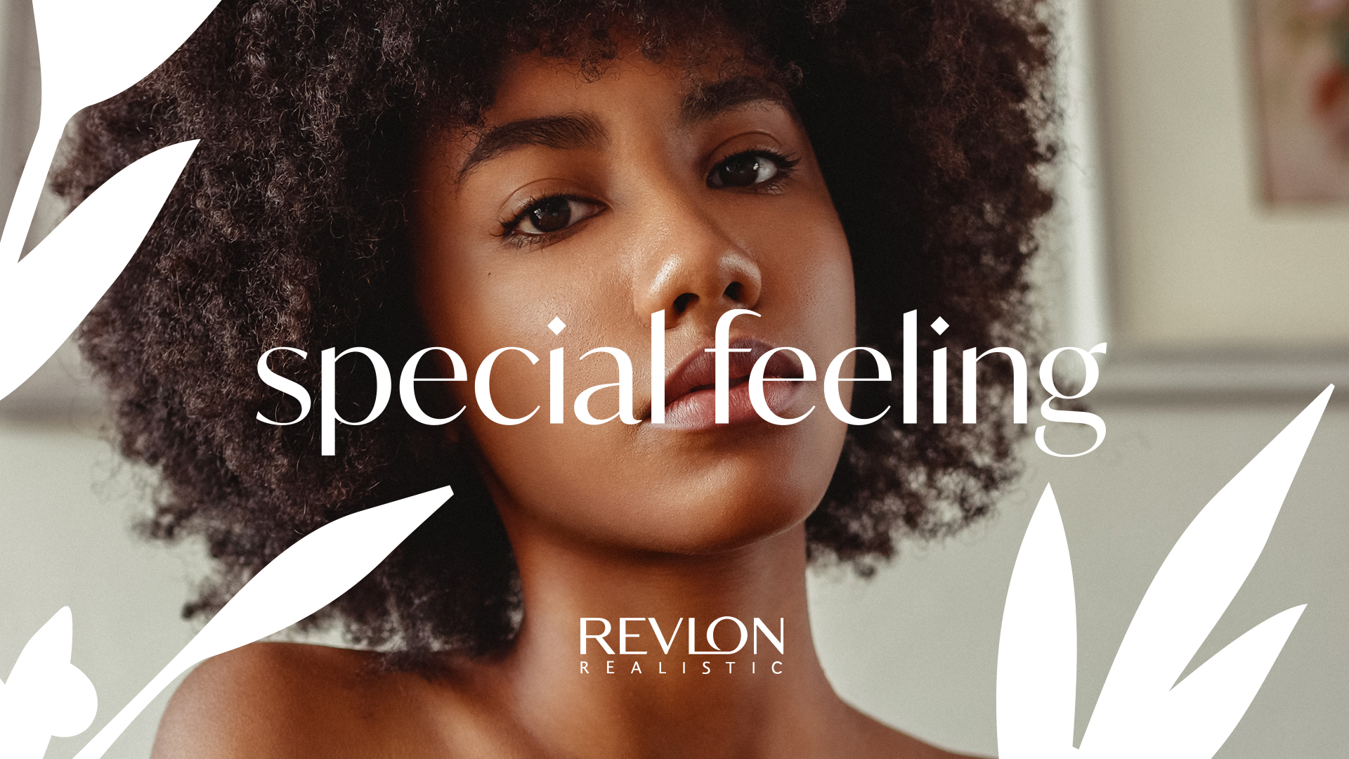
Revlon Special Feeling
Revlon Special Feeling, a trusted brand since the 1980s, has been a staple in the South African beauty market, known for its reliability and dedication to delivering quality hair care products. With a broad customer base that spans decades, the brand has established a strong presence, particularly for its products catering to afro hair types. As consumer preferences shift towards natural and premium products, Revlon Special Feeling saw an opportunity to expand its product range while modernizing its brand image to stay relevant and competitive.
Scope: Brand Identity, Redesign, Packaging Design, Art Direction
Special Feeling / 2024
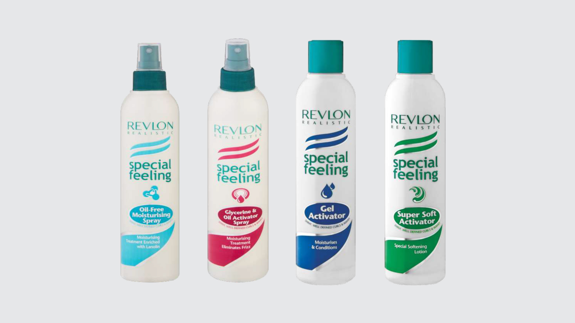
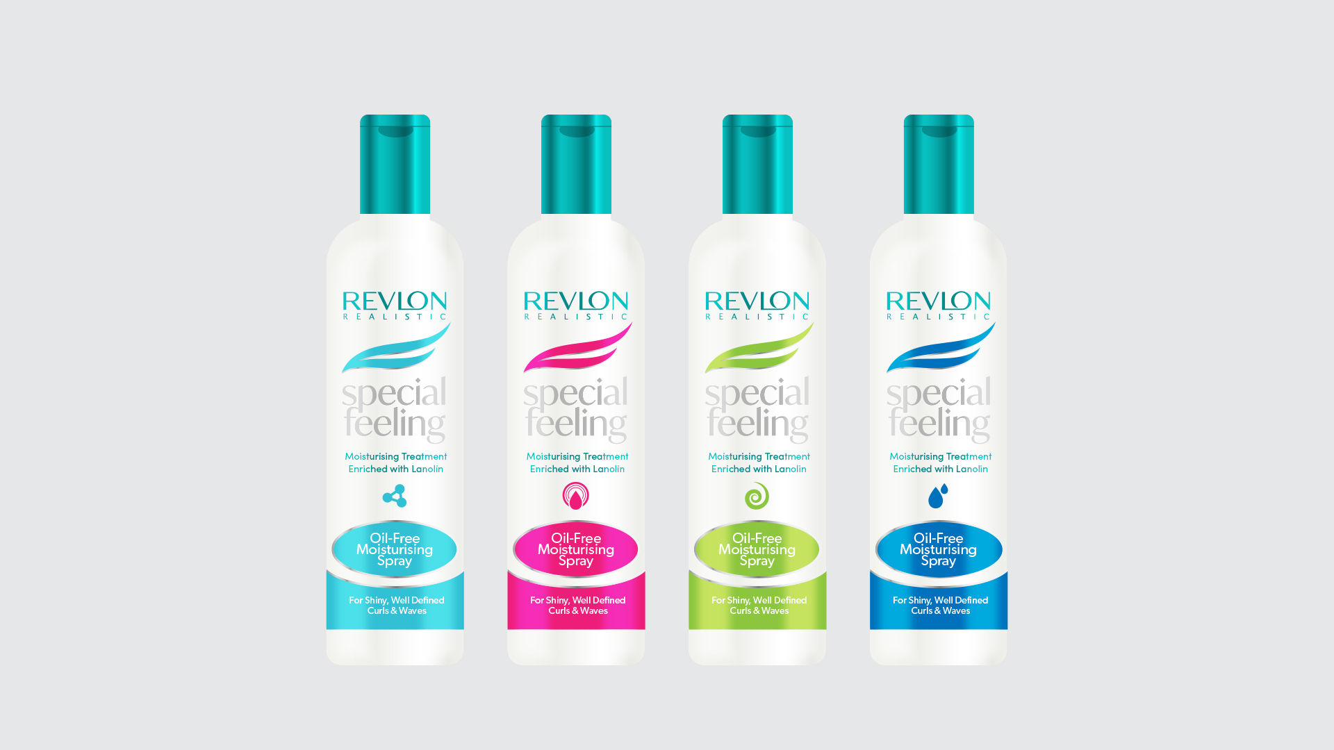
Existing packaging range
Challenge
The dual nature of the project presented a unique challenge. On one hand, I needed to create a fresh and innovative design for the new natural hair range that clearly communicated the product’s premium quality and natural ingredients. On the other hand, I had to modernize the existing packaging without alienating long-time customers who were familiar with the brand’s classic look. The South African market is particularly sensitive to packaging changes, and even subtle shifts can significantly impact consumer perception and brand loyalty.
Additionally, the new product line needed to seamlessly integrate with the existing range on retail shelves. This required a careful balance between introducing new elements that signaled the products’ natural and premium qualities while retaining enough of the original design elements to maintain brand continuity and recognition.
Solution
To address these challenges, I began with user research to identify the key visual elements that made the Revlon Special Feeling products recognizable to consumers. I discovered that specific graphic elements, shapes, and color schemes were crucial to brand recognition. With these insights, I carefully crafted a design strategy that balanced modernization with familiarity.
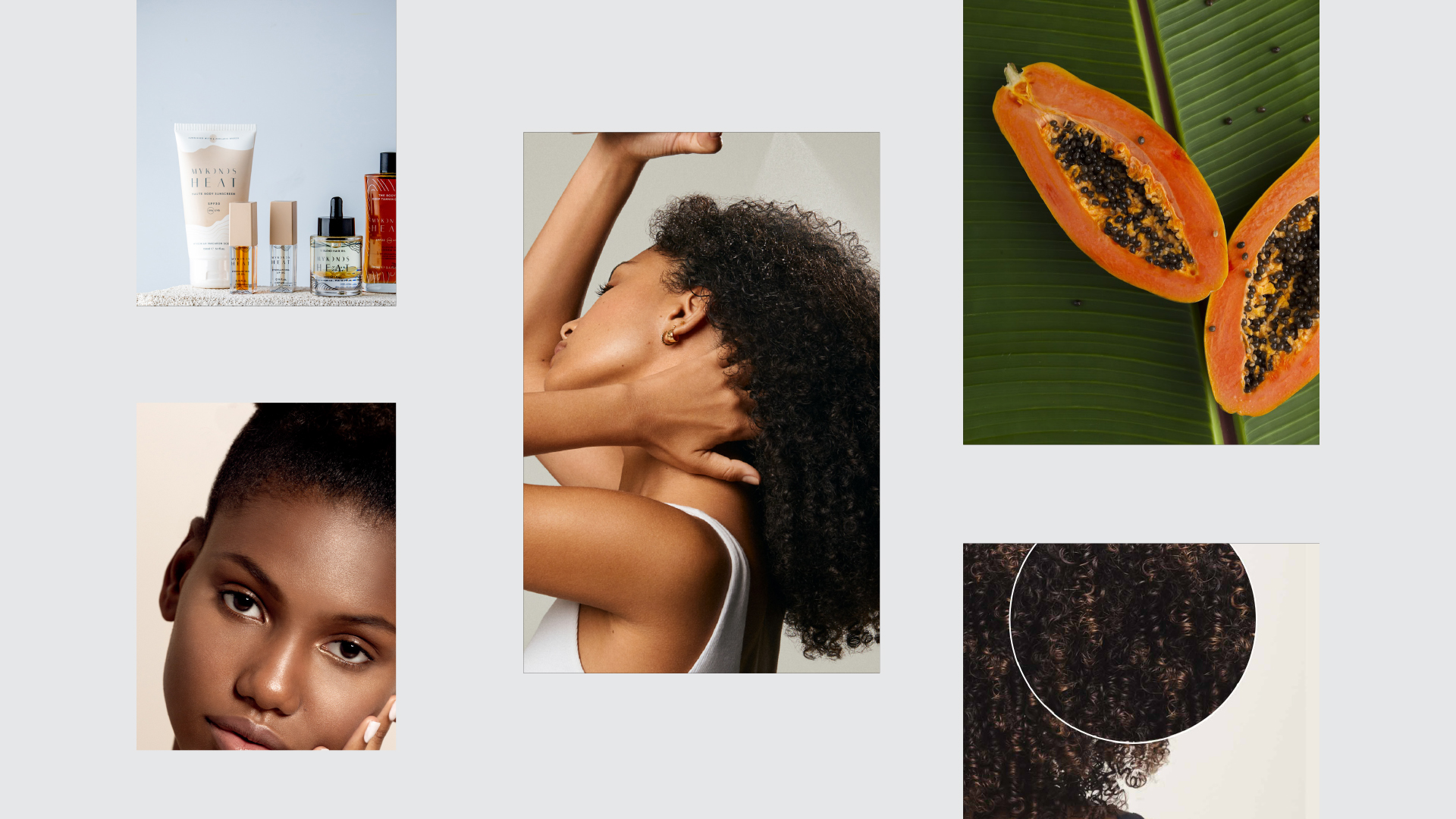
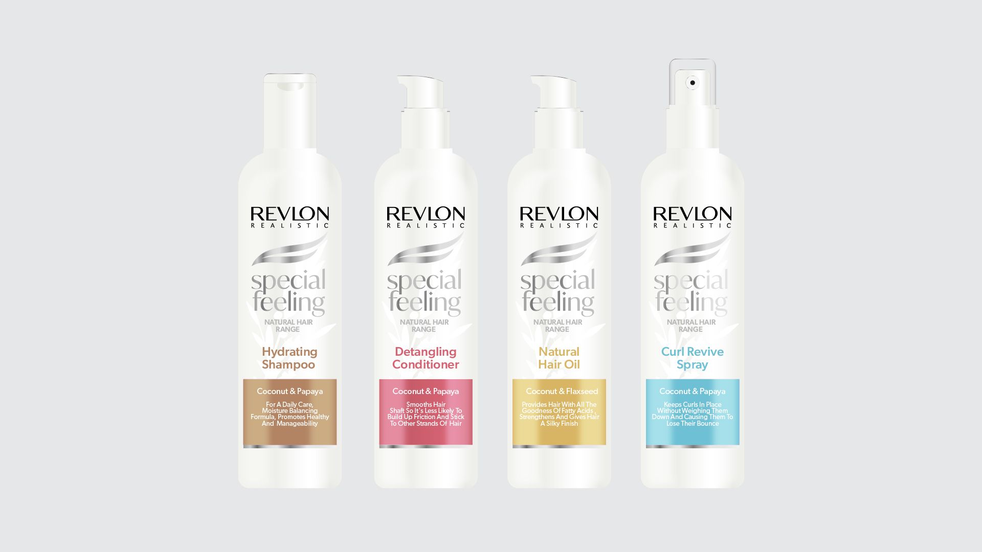
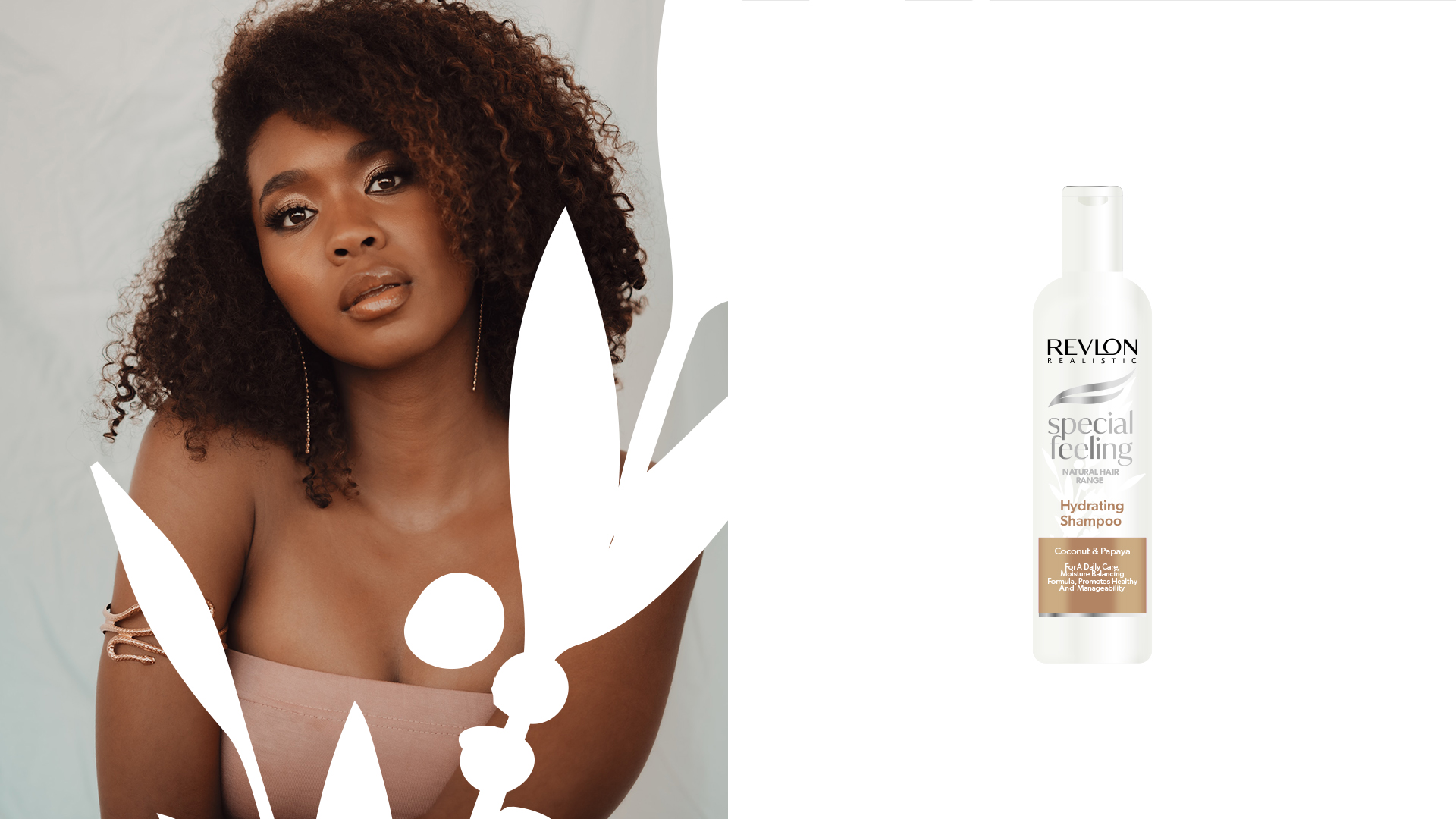
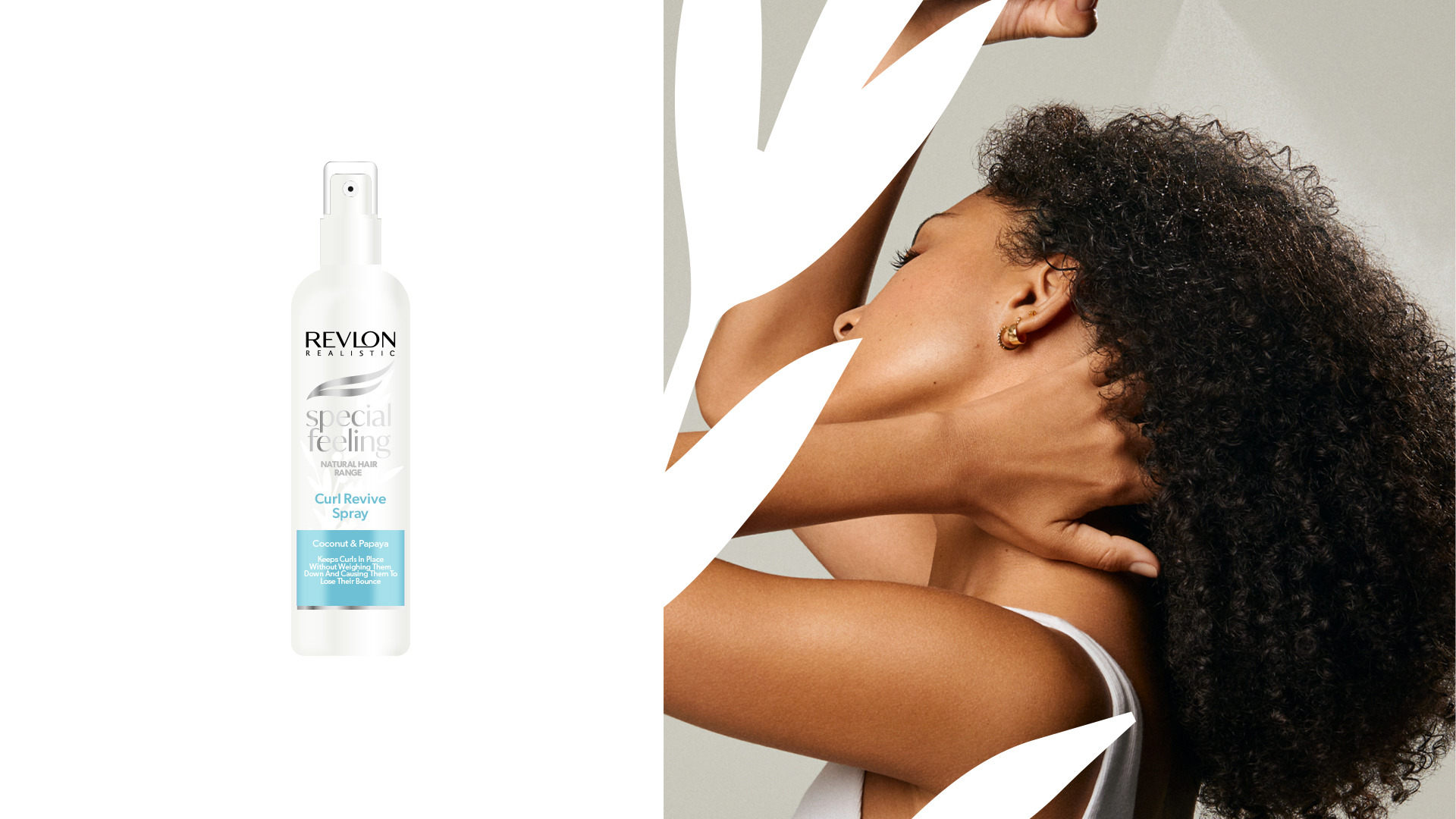
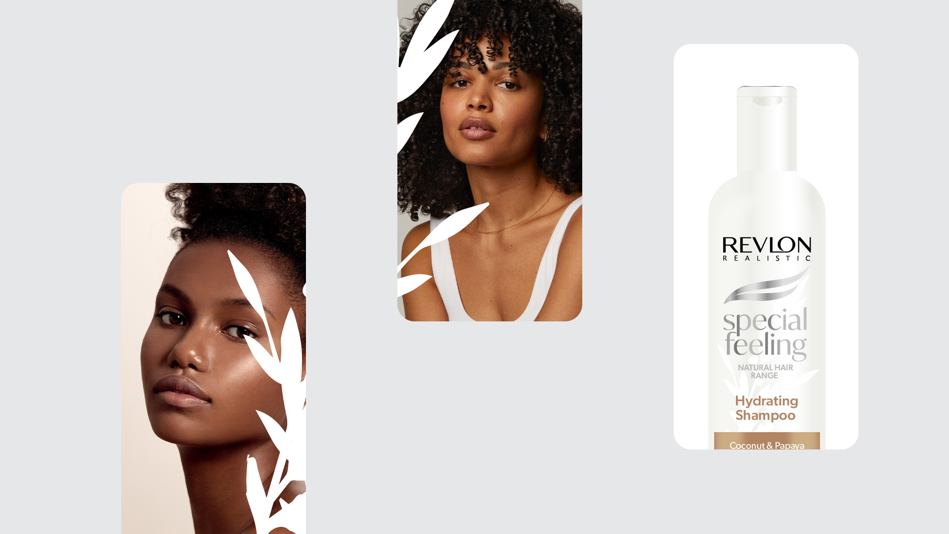
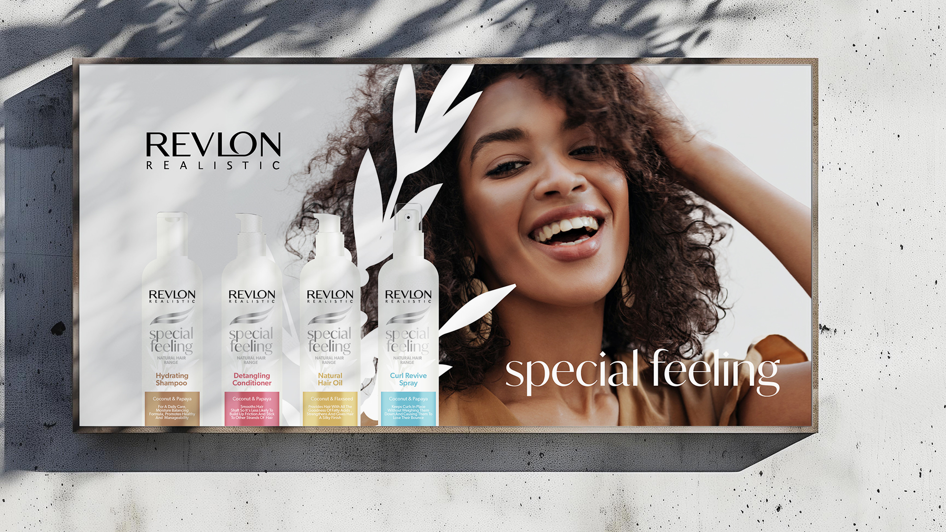
For the new Special Feeling natural hair range, I developed packaging that incorporated earthy tones, clean typography, and organic shapes, conveying a sense of natural, premium quality. These design elements were chosen to resonate with the target group’s desire for authenticity and high-quality ingredients while also appealing to their aesthetic preferences.
For the existing range, I decided to completely update the typography system, introducing modern and elegant typefaces that would refresh the product line without disrupting its established identity. I retained the recognizable two-line swoosh graphic element but refined it to enhance its aesthetic appeal, ensuring it complemented the updated typography and overall design. The information flow on the packaging remained similar to maintain continuity, while other visual elements were updated to provide a more contemporary look. The colors for each SKU were preserved to ensure immediate recognition on the shelves.
The result was a modern, visually polished, and balanced design that maintained a strong foundation in the brand’s heritage. This approach provided a seamless transition for customers and allowed for easy extension into the new product range, ensuring consistency across the brand’s offerings.
My design choices were guided by the understanding that packaging not only protects the product but also plays a crucial role in influencing consumer behavior and choices. A positive first impression can significantly enhance a product’s appeal, especially in an era where online purchasing is increasingly dominant, and the packaging often serves as the first point of contact with the customer. By creating a look that is both eye-catching and emotionally resonant, I aimed to strengthen the brand’s position in the market, drive sales, and foster continued customer loyalty.

Conclusion
Through this project, I successfully navigated the delicate balance between innovation and tradition. The new natural product line achieved a fresh, modern look that appeals to contemporary consumers, while the redesigned existing range maintained its core brand identity, ensuring continued recognition and trust among loyal customers. This dual strategy not only helped Revlon Special Feeling expand into a new market segment but also reinforced its standing as a beloved brand in the South African market.